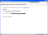
i only saw it first hand for the first time today (despite being an avid google user) and i already have concerns...
the first is that you don't see the warning until you click on the result from their results page... why not save the user some hassle and just mark up the results page like siteadvisor does? i mean, really, it shouldn't be that hard (it might make siteadvisor redundant, however)...
the second is worse, however... of the options it gives the user for continuing from the warning page, the easiest one for the user to choose is to go on to the bad site... this is backwards - if google really wants to help people they should make the safest option the easiest one to choose - that means it needs a backlink, a box to enter a new query, and something that makes it more difficult to click on the mal-link like a checkbox that says "i understand that the site contains badware and want to visit it anyways" that must be checked before the mal-link can be click on...
come on, folks... this is basic secure UI design, surely all those big brains in the googleplex understand such a basic principle as making the right choice the easiest choice...
0 comments:
Post a Comment